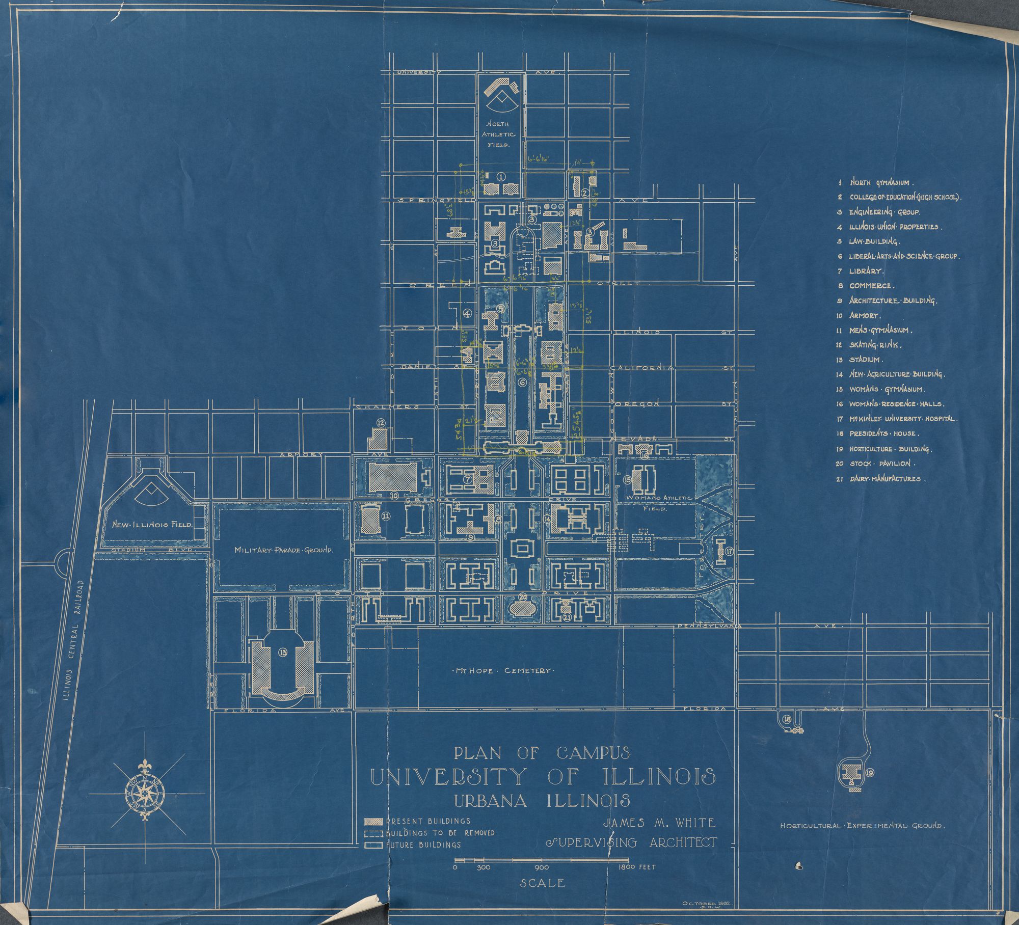
The Campus map from 1932 created by James M White, the supervising architect, shows the new construction plans along with permanent structures and buildings to be removed on campus. Made available to the public online through the University of Illinois Archives, this map is one of many historical architectural maps of campus. The information for this particular map came from a previous map dated 1930 that was designed by the same supervising architect. The visual language depicted here shows new building plans, buildings to be taken down and permanent structures, allowing us to see a step in the long process of constructing the campus we know today. During this time in America, the nation was undergoing the Great Depression. The new Armory had just been constructed having been completed in 1927, with three trees planted out in front as memorials for three U of I students that died in WWI. To provide some context, Memorial Stadium was completed in 1923. The term “Fighting Illini” was a rallying point towards its construction as a way to honor alumni, staff, and students who died during the war.
Back in the 1930’s campus was very different from the way it is now–, namely it was much smaller. Although there were trolleys linking the cities of Champaign and Urbana, transportation from one end of campus to the other was pretty limited, whereas now we have CUMTD busses running all day, something that today’s students likely take for granted. Additionally, today we have sidewalks running through the main Quad, whereas in 1932 they did not exist, making it more difficult for students to get to their classes. The campus that exists today is much larger than what it was in 1932, and the map depicts a moment in time of transition. Zooming in on Boneyard creek, this map shows it running through a “future building (solid white outline), indicating that it will have to be rerouted for the new construction to take place. Knowing the campus cultural history of Boneyard creek, these structural changes to campus still did not put an end to the tradition of dunking freshmen and having a class tug-of-war over the creek.
Because this map was created by the lead architect of the construction of new buildings at UIUC, it was probably not meant for the general public to see. Therefore, some lines are smudged, there are yellow lines with measurements listed that are not included in the legend, and most buildings are not labeled. We can only see the shapes and locations of buildings and not their interiors of functions, which leaves out important context for interpreting what campus was like in 1932. We can only overlay our current knowledge and experiences to infer what the buildings and campus as a whole were like, even though they were most likely drastically different from that with which we are presently familiar. Finally, there are no dates included to refer to when the new buildings will be completed and the old ones will be taken down, which hinders us in determining which plans were executed first. The scale is appropriate to the map, because the shapes of the buildings are recognizable, and the street names are visible as well. Providing dates and times of the construction periods for each building would help us to understand when these buildings will become a part of campus.
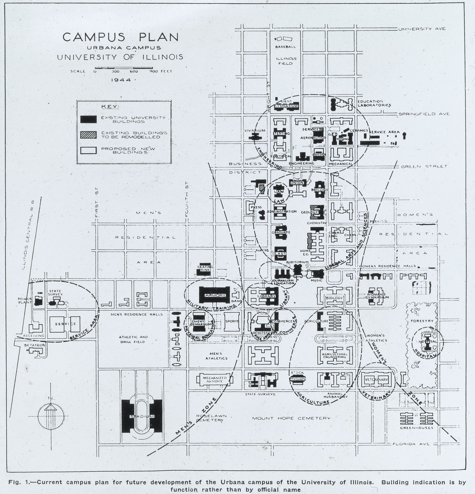
The 1950s were a time euphoric bliss for Americans. The victory of World War II led to a period of low unemployment and inflation, as well as economic and fertility boom. But women couldn’t help but feel confined by the obligation to leave the workforce to birth and rear children in the Levittowns of America. The social pressure and feeling of inferiority of women in the 1950s is something that persisted throughout the University of Illinois’ campus and can be seen on the Functional Campus Plan.
The data for this Functional Campus Plan likely originated from the Office of Facility Planning and Management. The caption at the bottom of the map, “building indication is by function rather than by official name,” gives a map reader insight that the information used to create this map was coming from within the University. According to the University of Illinois map library, “it is not unusual for maps published by organizations to not have any indication of the employees who actually did the work.” The dashed line zones shown on the map, likely created by the draftsmen, display the central perspective of the map, specifically the separation between men and women on campus. Coming from the perspective of women on the University of Illinois’ campus in 2017, it is alarming to see the stark and deliberate separation between men and women on a published document. This map was created in 1944 but republished in 1952, very close to the birth of the civil rights movement in the United States. It is hard not to notice the clear separation between the two gendered zones. One might assume that the draftsmen of the time were trying to emphasize the importance of separation between the two genders, and as a women reading the map, it can be assumed that the drafts’men’ at the time were indeed men. In 2017, roughly 60 years later, the deliberate separation between men and women is no longer physically constructed, but the social construction of separation still persists.
By titling the map as a Functional Campus Plan and emphasizing the gender segregation the map gives the impression that there are areas in which men and women use space differently. It makes one believe that there are areas in which women are not welcome to occupy space. In the 1950’s the civil rights movements started to unfold, it is hard to see that from this map, which give the impression that issues such as gender equality was not something the university valued until later. Busey-Evans, a women’s residence hall, is located in the women’s zone of campus. The functional campus map is more recent than the residence hall, but its location and function have remained the same since its opening. Is this a piece of history being preserved or gender segregation still being prevalent in physical space?
Viewing this map in 2017 the two-gendered zones feel outdated, it is no longer widely accepted that men and women should be physically separated. The current campus plans emphasize inclusion, diversity and sustainability. There are no remnants of the gendered segregated zones in the official campus plan, however, there are still social constructions making women feel unwelcome and unsafe in certain areas of campus.
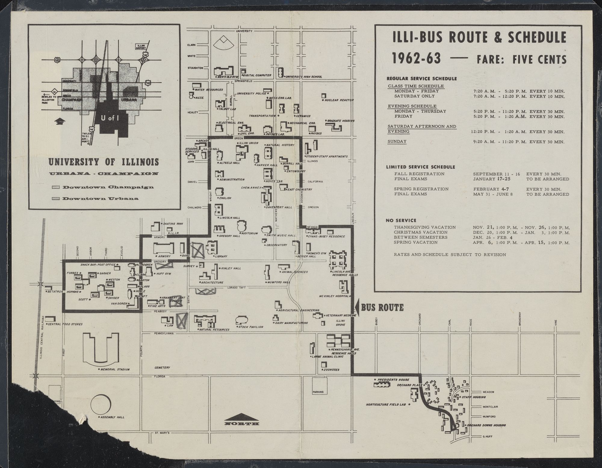
This map is about Illi-Bus system in University of Illinois at Urbana-Champaign, especially about the route and schedule around campus. The map was made by University of Illinois in 1962. The bus system was first started in 1901 for a short time period and service was operated by the Illinois Motor Transit Company. Since 1925, the buses had been used in conjunction with streetcars. This map has all data based the bus system in school during that day. This map is typically useful for students and faculty to take convenience between classes and resident halls to classroom halls. During 1953 to 1979, the Baby Boomers happened in U of I campus which caused the school suffered from a heavy space deficit, and the school need to build more facilities and enlarge the campus. In 1960, U of I received large amount of funds from state government to launch a great number of building programs to help the space needs issue. Also, during the same time, the school had tightened the admissions for improving the academic standards. The high-quality students needed to be more efficiency in studying and working in school. The bus system is very necessary during that time, due to the size of campus and efficiency needed. This map also included the schedule of bus which could help riders plan ahead with no late to class or work.
The bus route is mostly within the campus in order to provide convenience for students and faculty. During that time, most students lived in the dormitories provided by the school. Thus, they might only consider the map as a transportation for commuting. The map was served for school only and ran according to the school calendar. But today the bus is considered as one of the important public transportation services and not only serves school but also the citizens within the area. The map maker intended to show bus routes on campus and surrounding cities and included an inset of campus and the fare schedule, which provided a clear schedule and fare information to the audience. But the bus stops and direction, which supposed to be vital elements in a bus route map are missing in this map, leading the audience puzzled about how the bus runs. From the map, we can only assume that the bus was requested to stop by the passengers.
Overall, this map presented Illi-Bus route and schedule in the time period 1962-1963 and provided some useful information for the people at that time. However, as a bus route map, this map failed to provide detailed information which might lead to confusion from the audience who was new to the bus-riding scene. Since maps have a way of speaking to people very straightforwardly, when an audience reads the historical map, they do not need to have a lot of knowledge of map history or history in general. From this map, an audience can learn a lot from the bus route of University of Illinois at Urbana-Champaign in the time period 1962-1963.

This 1981 map of the University of Illinois campus gives a less structured view of how the campus may have been visualized back then. Highlighting local businesses, campus buildings, and even displaying advertisements, this map does more to catch the eye than it does to give an accurate representation on the UIUC campus. There is not any real quantitative data going into this map. Instead it seems to be a qualitative view of the Champaign Urbana Campus from the eighties. To give a historical context for this time period, it might be important to know that Ronald Reagan succeeded Jimmy Carter as the 40th president of the United States. The United States was also in a severe recession during this time period. This map however does not seem to show any signs of a recession. In fact the map seems to have a large amount of business backing to it with the large amount of advertisements present in the map. This map does little to give an actual understanding of the geography of the University of Illinois campus, but instead shows it in a somewhat comical and cartoonish way. There is a large amount of distortion in this map, with entire streets excluded for miles to allow space for more relevant buildings such as the football and basketball stadiums. This maps main focus is to draw attention to the more relevant and important areas on the UIUC campus, as well as promote businesses such as Busch and Coca Cola. Local malls, themed shops and restaurants sponsoring the university are seen many times throughout the map. Some names are familiar, like Domino’s, Zorba’s, or campus bars like Kam’s. Other promotional material for Coke, Busch and even a jeans retailer hints to a possible advertisement orientation of the map. Not only are bars, hotels and restaurants highlighted, but some locations even include a phone number. One interesting addition to the map is on the far right side. Lincoln Square Mall is seen along with Carson’s, now Macy’s. What is interesting about this placement is that it seems to be located right on Goodwin Ave. Those familiar with campus know that Lincoln Square mall is actually a mile east in downtown Urbana. This further shows a possible sponsorship of the map by vendors interested in being associated with the campus in 1983. The last significant theme present in the map is school is the former mascot, Chief Illiniwek. The bottom right hand corner is dominated by his presence. This is not the only chief seen, however. Near campus town there is another Native American figure that appears to be intoxicated. Other images of drinking characters of seemingly Irish descent are present in the area as well. All of these aspects point to a map that is trying to promote the drinking culture at University of Illinois, as well as appeal to those who appreciate a large commercial presence in and around the campus.
Some of the businesses on the map no longer exist. Eisner’s Food Stores was rebranded to Jewel that decade and later closed in 1998. Some of the campus landmarks are still popular today, but they’ve had their names changed at some time after the map was made: Assembly Hall, IMPE Building, ILIR, etc. Many current buildings aren’t included because they weren’t built yet (ACES Library, Beckman Institute), or they weren’t considered significant enough to be included (Wesley Foundation, Boneyard Creek). The map does not provide much information on who made it or why itwas made. It was produced by a Durham, NC marketing company around 1981, but no author is cited. Whoever the author is, they are probably not a Champaign-Urbana local. The map’s creative design suggests it was made for artistic purposes, not for navigation or reference. The map highlights local businesses, notable buildings, and places of interest around campus. Presumably, this represents what was popular in 1981. Many of the building names and businesses may seem unfamiliar to current locals. Additionally, some of the sites that are popular today are not on the map. The author made deliberate choices to decide what to include or exclude, and it’s not always obvious why.
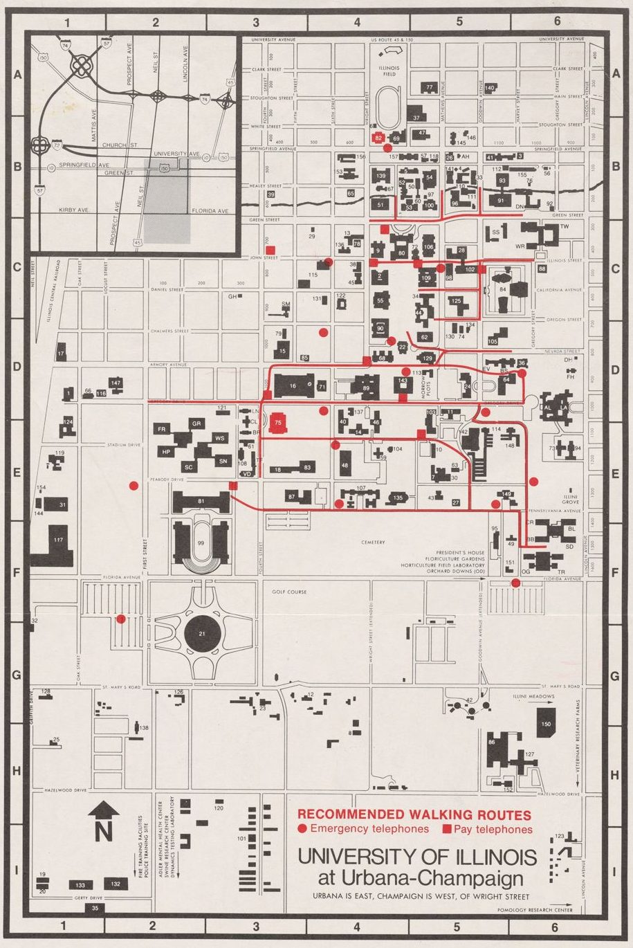
The Recommended Walking Routes map was created by the University of Illinois in the 1980s. The data was sourced from the Office of Publications and the University of Illinois. The map was distributed as a brochure throughout the campus. The map was intended for the purpose of preventing crime on campus by providing students with safe routes near emergency and pay telephones. The location of payphones plays an important role in reporting crimes because most people did not have cell phones in the 1980’s. Thus, the safest walking routes are linked to the location of payphones because this is the fastest way to contact the police in the event of a crime. In the early 1980’s, the university elected Stanley O. Ikenberry for president. He served for 16 years, 1979-1995, becoming the longest serving president in the history of the university. During his tenure he heavily focused on establishing the university as a world class research university and expanded the engineering facilities.
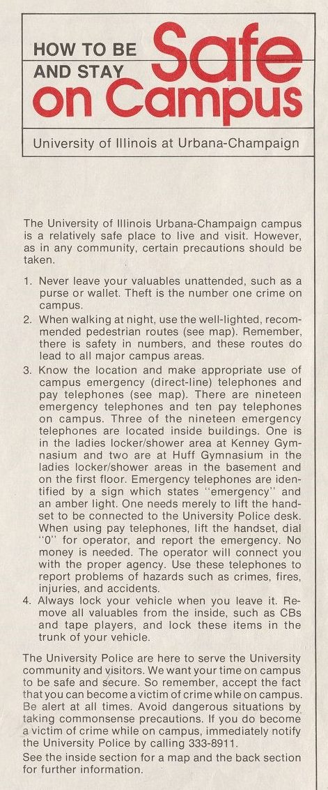
The map displays the main campus and properties owned by the University of Illinois. The majority of this map is in a black and white theme, with symbols of focus in red. Major buildings are scaled down to a black image which corresponds with its location. Buildings that were too small to be scaled down, or areas with key activities, are represented with a “**” symbol. The use of black and white creates a simple, neutral background that will not distract the viewer. The recommended walking routes, payphones, and emergency phones are represented in red. Red is a bold color which draws the attention of the viewer to the desired spaces. The recommended walking routes run throughout central campus and reach almost every main building. The pay and emergency phones are evenly distributed across the space, with some outlying locations near event areas.
Payphone locations today are distributed somewhat similarly to the 1980’s map, but there are a few differences. Today there are about three times as many emergency phones located across campus and they are in a much closer proximity to each other. The larger number of phones in the northern part of campus is due to boneyard creek development and the expansion of the university, rather than an increase in crime rates. Many areas past Green and Wright Street are not recommended as safe walking routes because they are far away from the main campus or are on the border of the campus property. Thus, it is difficult for the university to help ensure the safety of its students if they walked to far away from the main parts of campus. Furthermore, the University campus was expanding its infrastructure at this time and certain streets were under construction.
The main areas of the campus are easier to monitor and secure by police. Criminals are likely to commit crimes in areas that are not easy to monitor due to lighting conditions, visibility, and number of
pedestrians present. The 1980s also saw a dramatic spike in crime rates across the United States. This incline can be correlated to growing crack cocaine epidemic, occurring at the same time, which fueled drug-related crimes. These events can explain the appearance of similar safe route maps across the decade.